
Covered in this article:
Watch a video to learn about the topics belowIntroduction to Analysis on Pathzero Navigator
How to select a dataset and apply data filters
How to use the estimated emissions path chart
How to use the breakdown analysis chart
Where can I find more information about the terminology
Introduction to Analysis on Pathzero Navigator
The Pathzero Navigator Analysis page is a powerful tool designed to assist investment managers in achieving two primary objectives.
Firstly, it helps to identify areas in the portfolio where greenhouse gas (GHG) emissions data quality can be improved, ultimately leading to an improved Partnership for Carbon Accounting Financials (PCAF) score and greater accuracy in financed emissions calculations across the portfolio.
The Pathzero Navigator Analysis page features two interactive charts that can be customised based on the desired dataset, data format, and filter options.
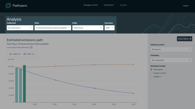
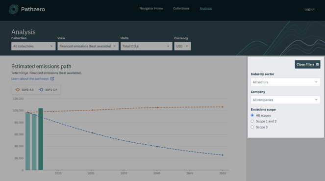
The first chart displays the estimated emissions path of your portfolio's total GHG emissions over time in two different climate scenarios. This chart provides valuable insights into the potential trajectory of your portfolio's GHG emissions and allows you to make informed decisions that align with your climate goal.
The second chart breaks down your portfolio's GHG emissions into several different categories for a given year. This detailed breakdown provides valuable information on the specific sources of emissions within your portfolio, enabling you to identify areas where emissions reductions can be achieved.
By customising the data and filter options in these interactive charts, you can gain a comprehensive understanding of your portfolio's emissions profile and take action to reduce your GHG emissions inventory.
How to select a dataset and apply data filters
The first step is to choose the dataset and format you want to analyse from the dropdown menus at the top of the Analysis page. Your selection will determine the data and format shown on the y-axis on both charts: the estimated emissions path and the breakdown analysis.
Here are the options you can choose from:
- Collection: You can select all your collections or a specific one.
- View: You can view financed or gross emissions.
- Financed emissions take into account the percentage ownership of your assets, showing only the proportion of the assets emissions you are indirectly responsible for.
- Gross emissions show the total emissions of the entire asset.
- Exiobase 3 is a key data source that we are using to enable the Pathzero Predictive model for industry benchmarking. The emissions calculation is based on your financial data and doesn’t include your reported data.
- Best available also takes into account your reported data where available.
- Units: You can select the total emissions in tonnes of carbon dioxide equivalent or the intensity metrics per full-time employee which applies only to gross emissions, or per million dollars invested which only applies to financed emissions.
- Currency: You can choose the currency of the intensity metrics per million dollars invested.
With the dropdown menus on the right-hand side, you can break down the data further by industry sector, company, or emissions scope by using the data filter. This works like the filter option in an Excel pivot table.
How to use the estimated emissions path chart?
The estimated emissions paths show two climate scenarios over time, known as Shared Socio-economic Pathways (SSPs). These scenarios are developed by the IPCC and show possible future global carbon budget scenarios.
A sector's carbon budget is the amount of emissions it can produce while remaining in line with an expected temperature outcome.
There are two SSP scenarios shown on the platform:
- SSP1-1.9, which represents a global temperature outcome of 1.6℃ above pre-industrial levels in 2050.
- SSP2-4.5, which represents a global temperature outcome of 2℃ above pre-industrial levels in 2050.
The estimated emissions paths can help you visualise your portfolio's carbon budget in line with the IPCC report.
However, it's important to note that this feature should not be used for setting net zero targets. Pathzero is currently developing a new feature that will help you set net zero targets aligned with the Science Based Targets initiative. This feature will differ from the currently illustrated paths.
More information about the glidepaths can be found in this knowledge base article: Understanding estimated emissions paths.
How to use the breakdown analysis chart
Once you've selected your desired dataset and data format, you can further analyse it by breaking it down into different categories and analysing it on a year-by-year basis.
To do this, you need to first select the category type you want to analyse. This selection will determine the x-axis of your breakdown analysis chart.
You have several options to choose from, including emissions categories, emissions scope, country, sector, and company. Once you've selected your category type, you can choose the specific year you're interested in. 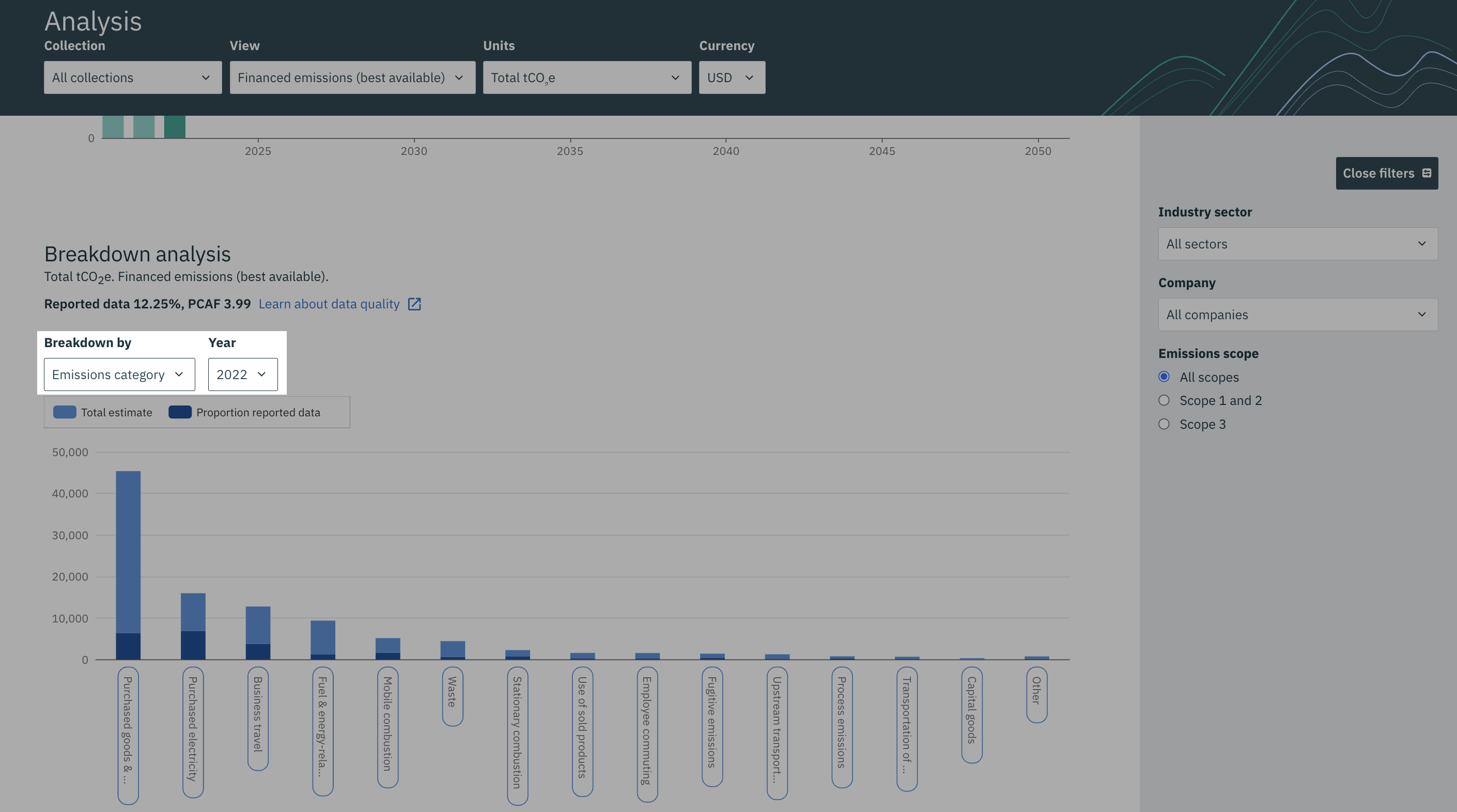
Where can I find out more information about the terminology?
Learn more in our sustainability glossary
If you need more help, please contact us at support@pathzero.com.